Overview.
The hubtel ux library has a nnumber of preconfigured dialogs developers can use. Dialogs include a success dialog, prompt dialog, loading dialog and an error dialog.
Success Dialogs.
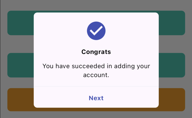
To show success dialogs to users, the core UX library exposes an extension on the stateful widget which can be summoned with widget.showSuccessDialog(:).
Example.
In this example, we are going to show a success dialog to a user for successfully adding an account. 
 widget.showSuccessDialog(
    context: context,
    iconBackgroundColor: Colors.indigo,
    message:
    "You have succeeded in adding your account.",
    title: "Congrats",
    actionTitle: "Next",
    actionTitleColor: Colors.indigo
    );
Error Dialogs.
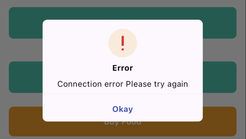
To show error dialogs to users, the core UX library exposes an extension on the stateful widget class which can be summoned with widget.showErrorDialog(:).
Example.
In this example, we are going to show a success dialog to a user for successfully adding an account. 
 widget.showErrorDialog(
    context: context,
    message: "Connection error Please try again",
    actionTitleColor: Colors.indigo,
    );
Info Dialogs
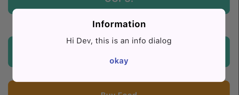
To show info dialogs to users, the core UX library exposes an extension on the stateful widget class which can be summoned with widget.showPromptDialog(:).
Example
In this example, we are going to show a simple prompt dialog to users. 
    widget.showPromptDialog(
        context: context,
        title: 'Information',
        buttonTitle: 'okay',
        subtitle: 'Hi Dev, this is an info dialog',
        buttonAction: () {  },
        buttonTitleColor: Colors.indigo
        );
Loading Dialogs
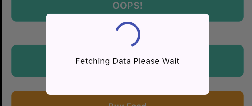
To show info dialogs to users, the core UX library exposes a global method loadingDialog(context:).
Example
In this example, we are going to show a simple loading dialog to users. 
CHAT SAMMIAT
